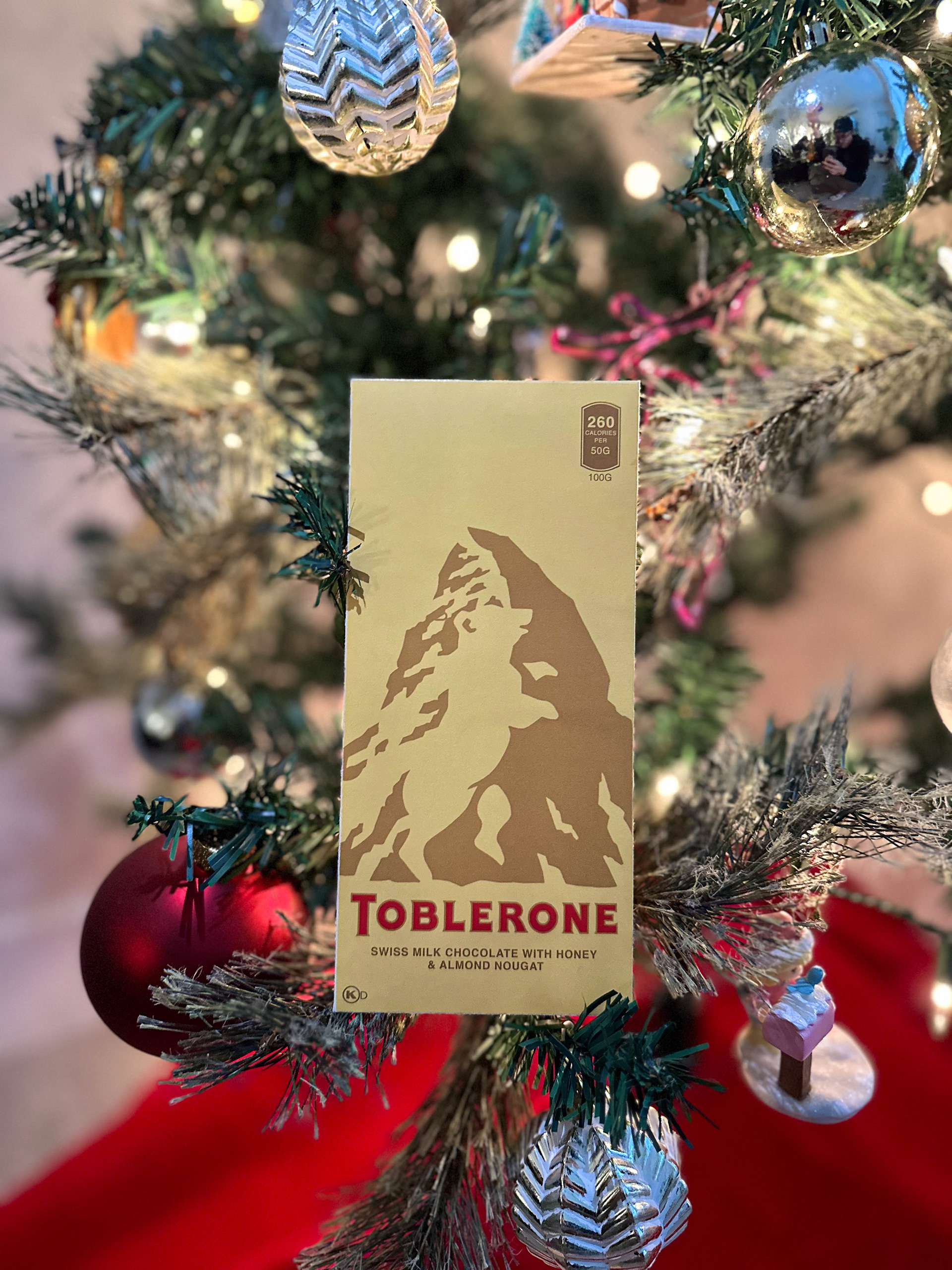
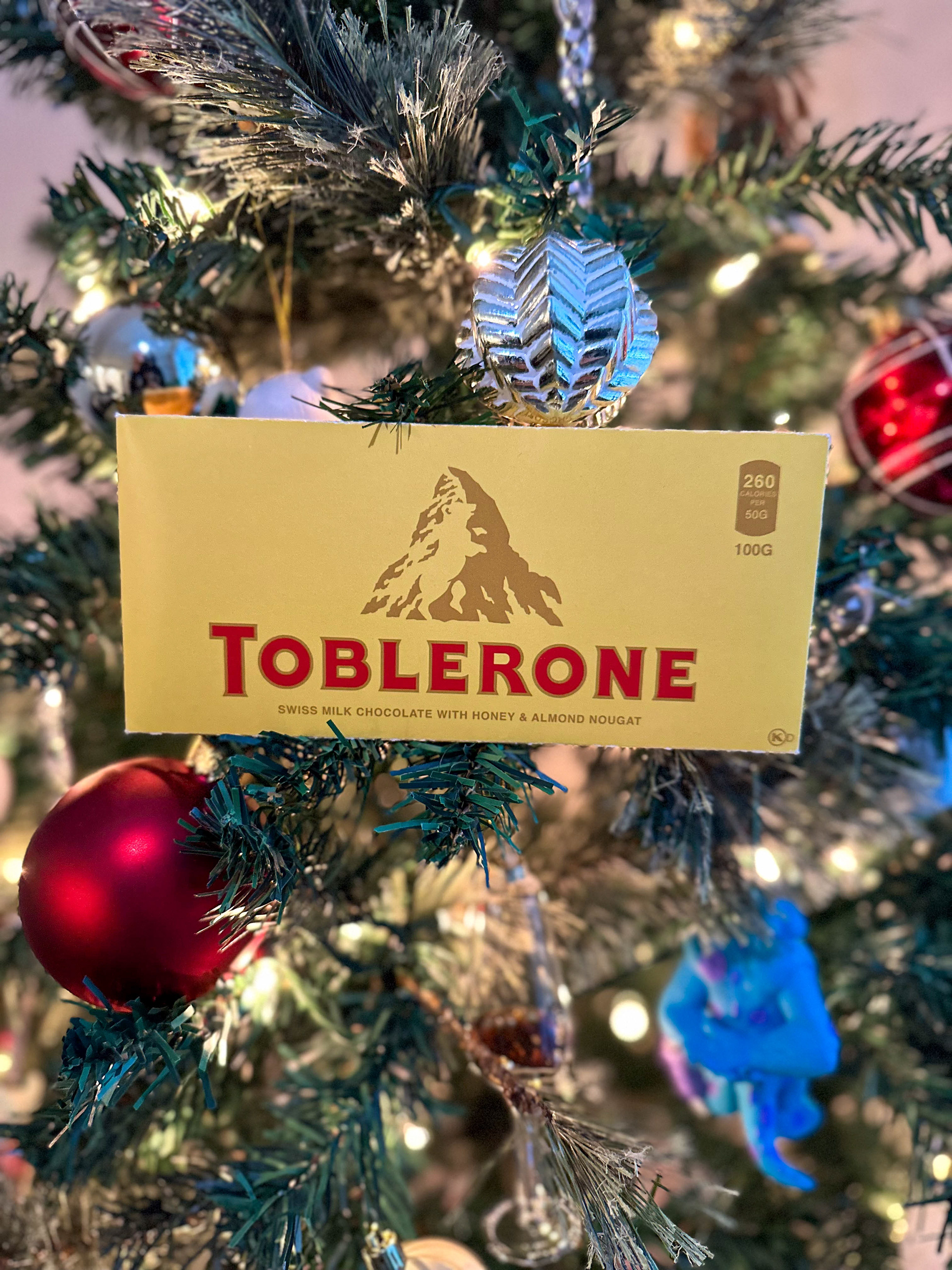
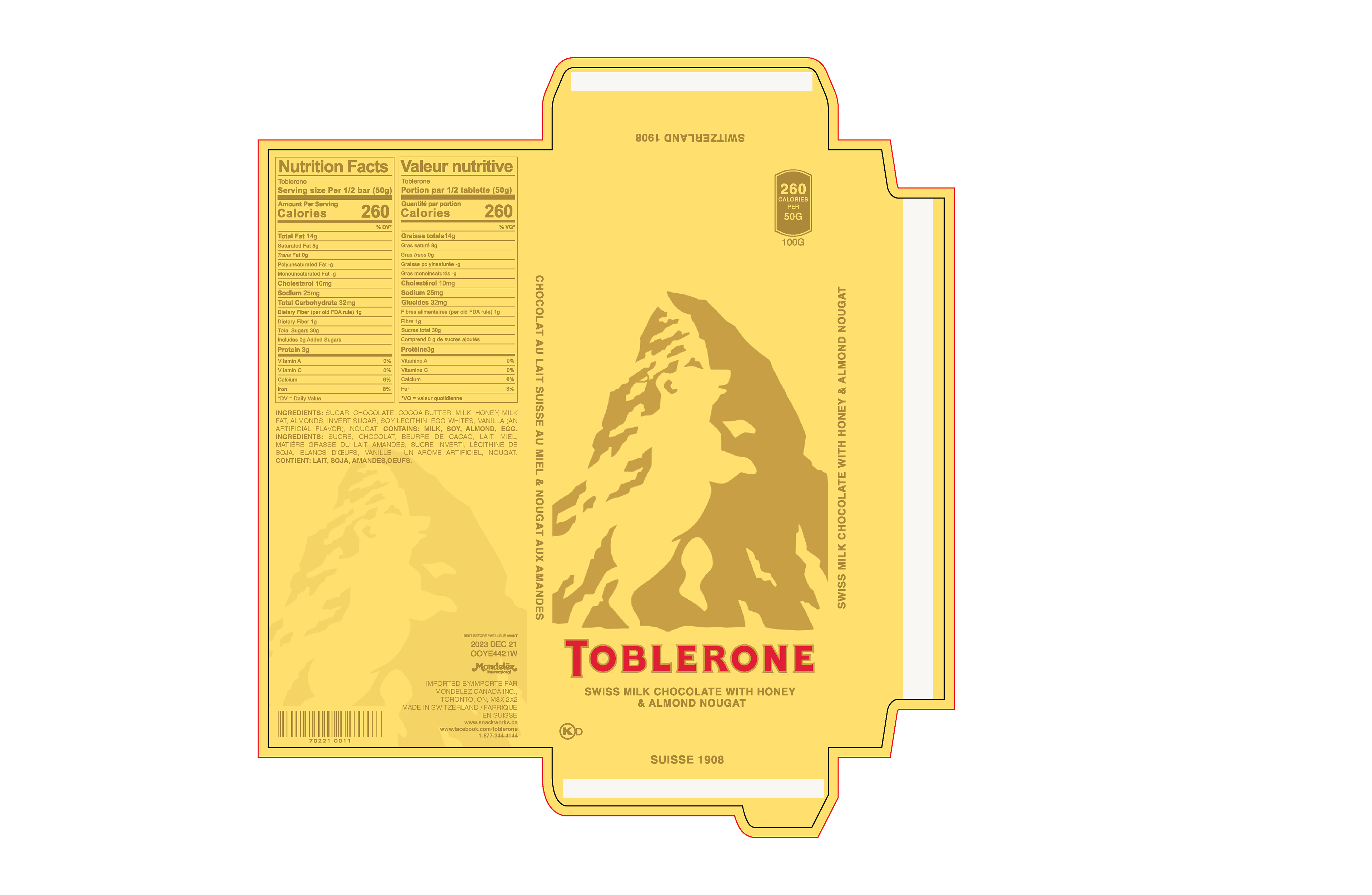
This design, chosen from the class, represents my two-color option, strategically maintaining Toblerone’s iconic gold and red hues, which proved instrumental in the success of this project. The choice of these powerful colors aligns with Toblerone’s brand identity. Emphasizing the mountain in the background is a crucial detail, creating an illusion that may not be immediately apparent, with the bear standing out upon closer inspection. Following critique sessions, valuable feedback regarding the lightness of the text was received. In response, adjustments were made to darken the text, ensuring readability. Additionally, the incorporation of the “open here” symbol serves as a clear directive on the proper method of opening, enhancing the user experience and functionality of the packaging. These refinements contribute to the overall effectiveness and clarity of the design.
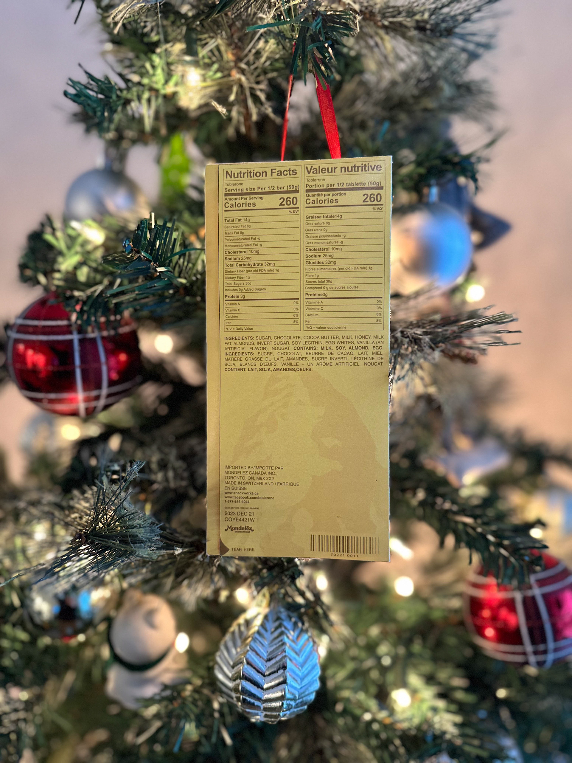
In exploring a different perspective for my design, I aimed to retain the focal point—the mountain. Transitioning to a vertical layout, I adjusted the size of the mountain to ensure it remained a prominent element for users. A subtle yet impactful modification was the introduction of a “tear here” option, replacing the conventional “open here.” Given the altered orientation, this change directs users to look downward at the bottom left, offering clear guidance on the proper method of opening. This adjustment not only aligns with the new layout but also enhances the user’s engagement and understanding of the packaging.
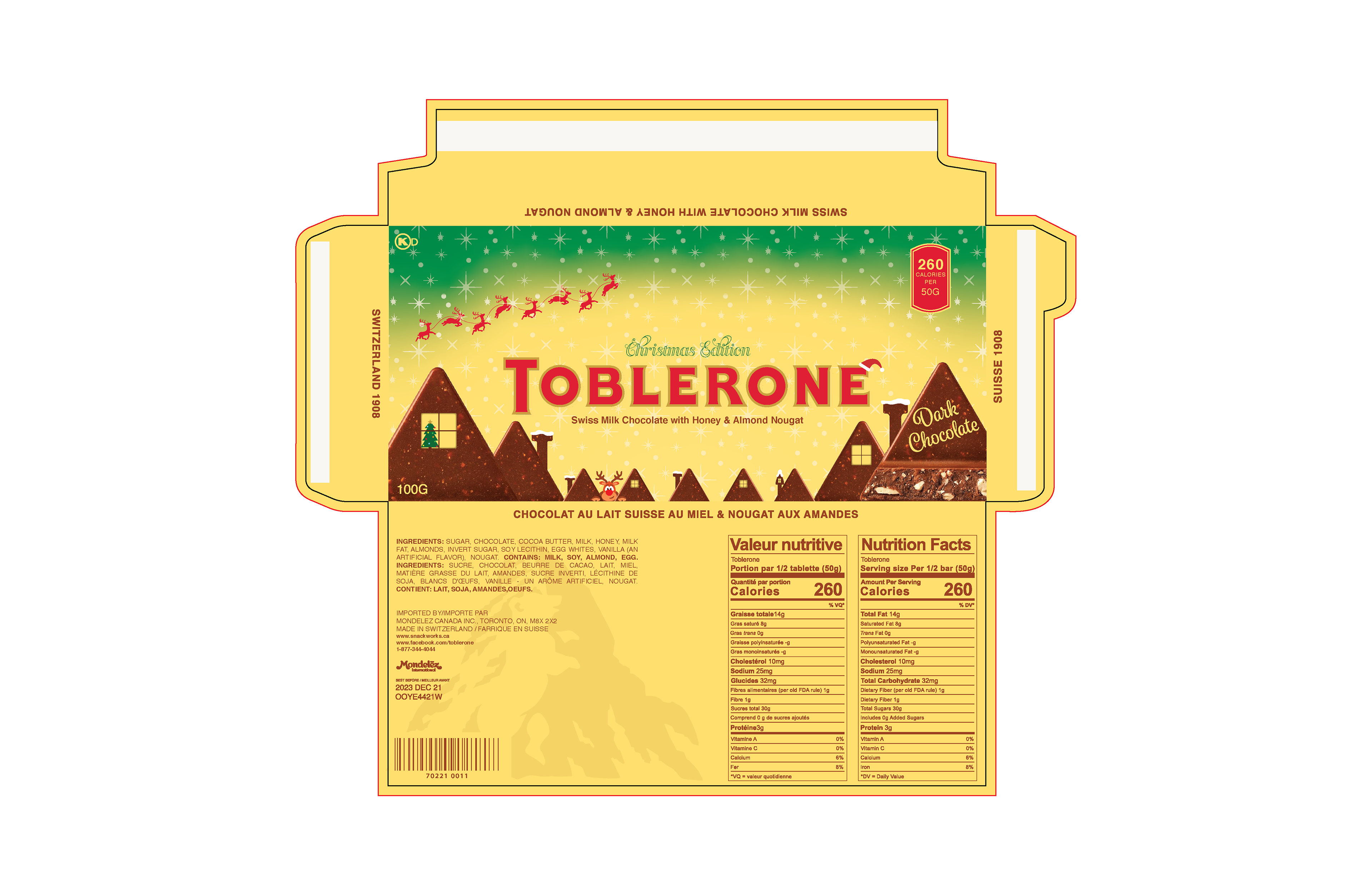
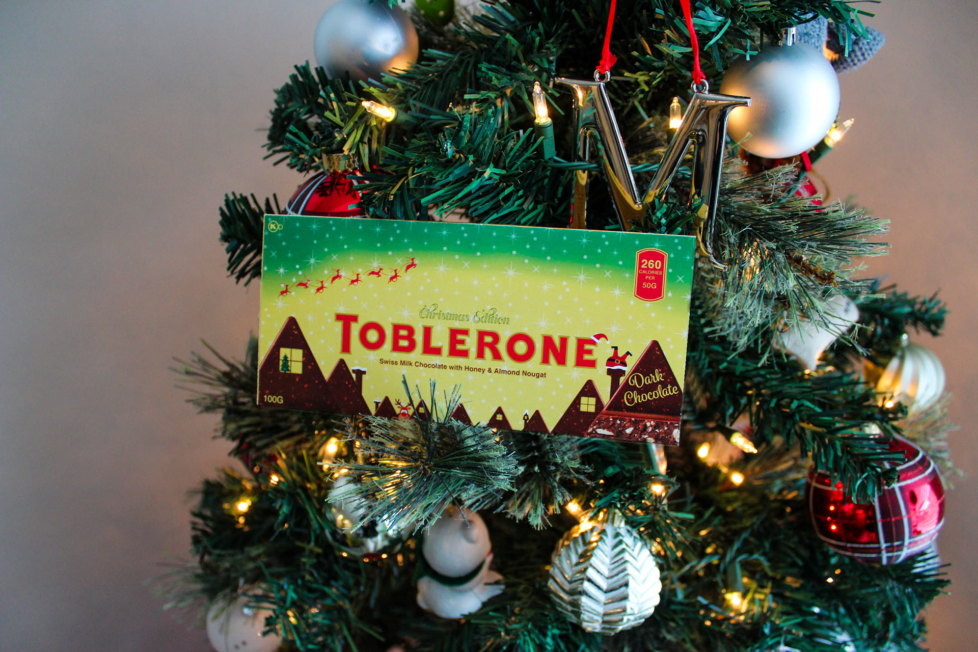
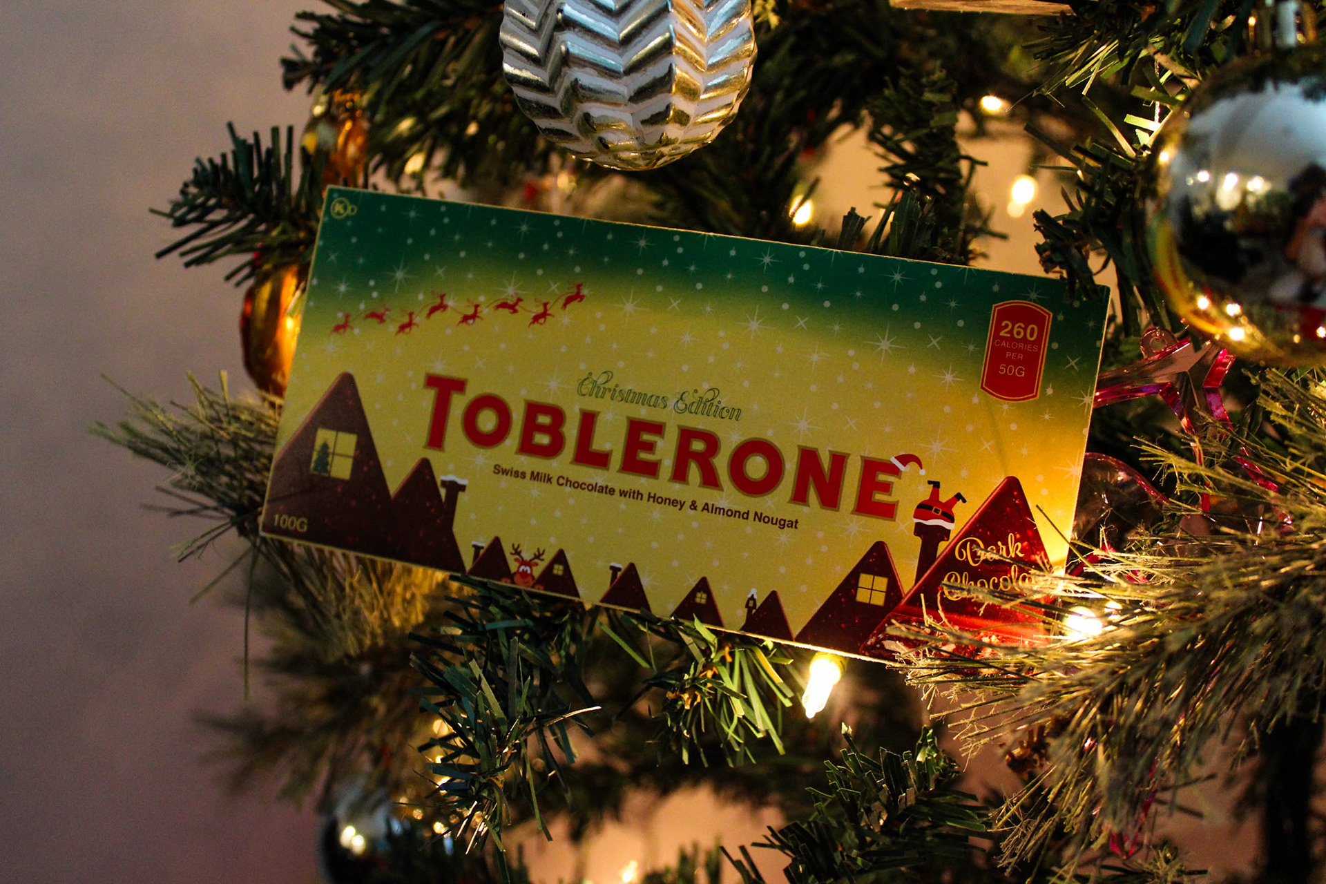
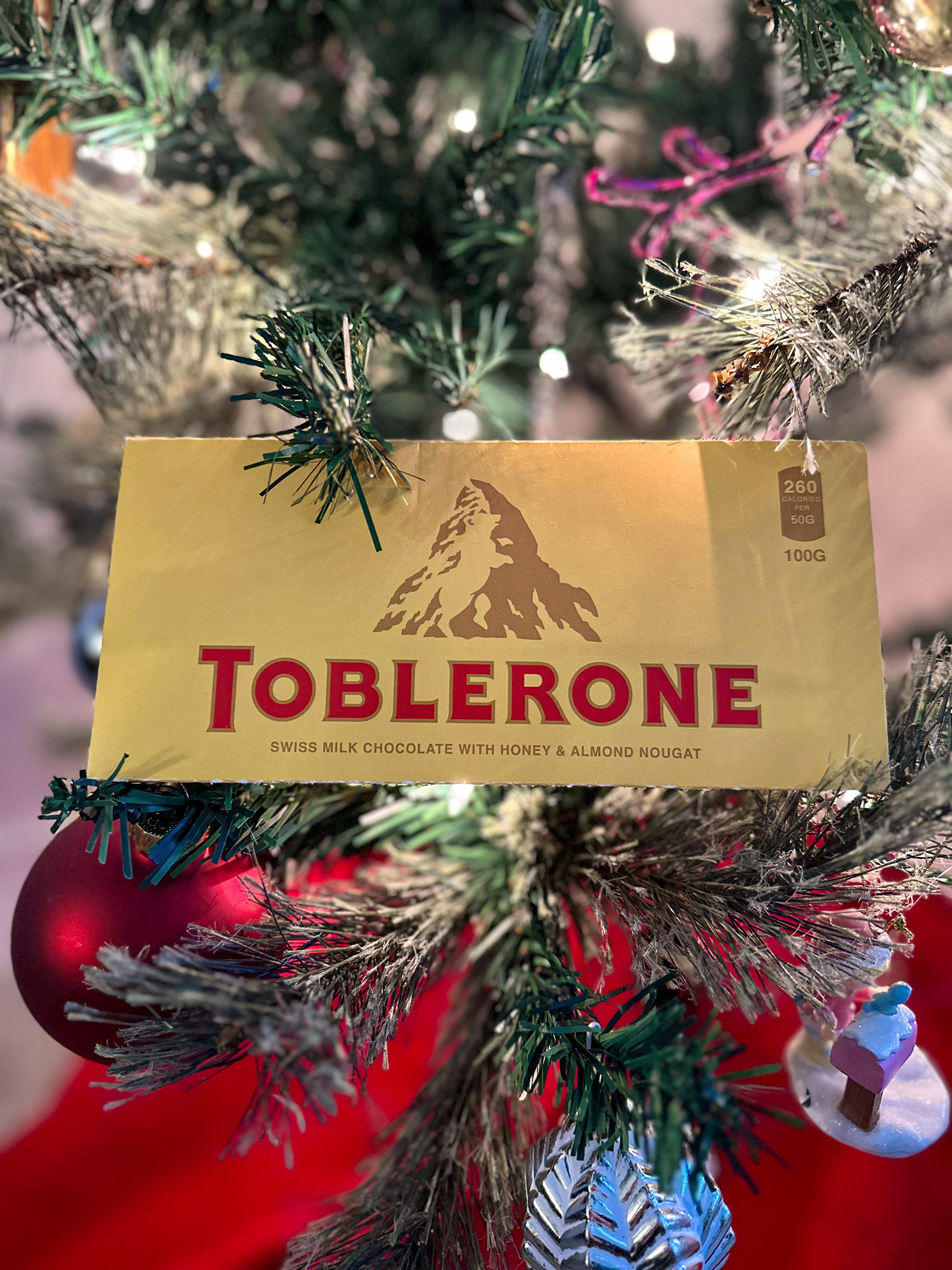
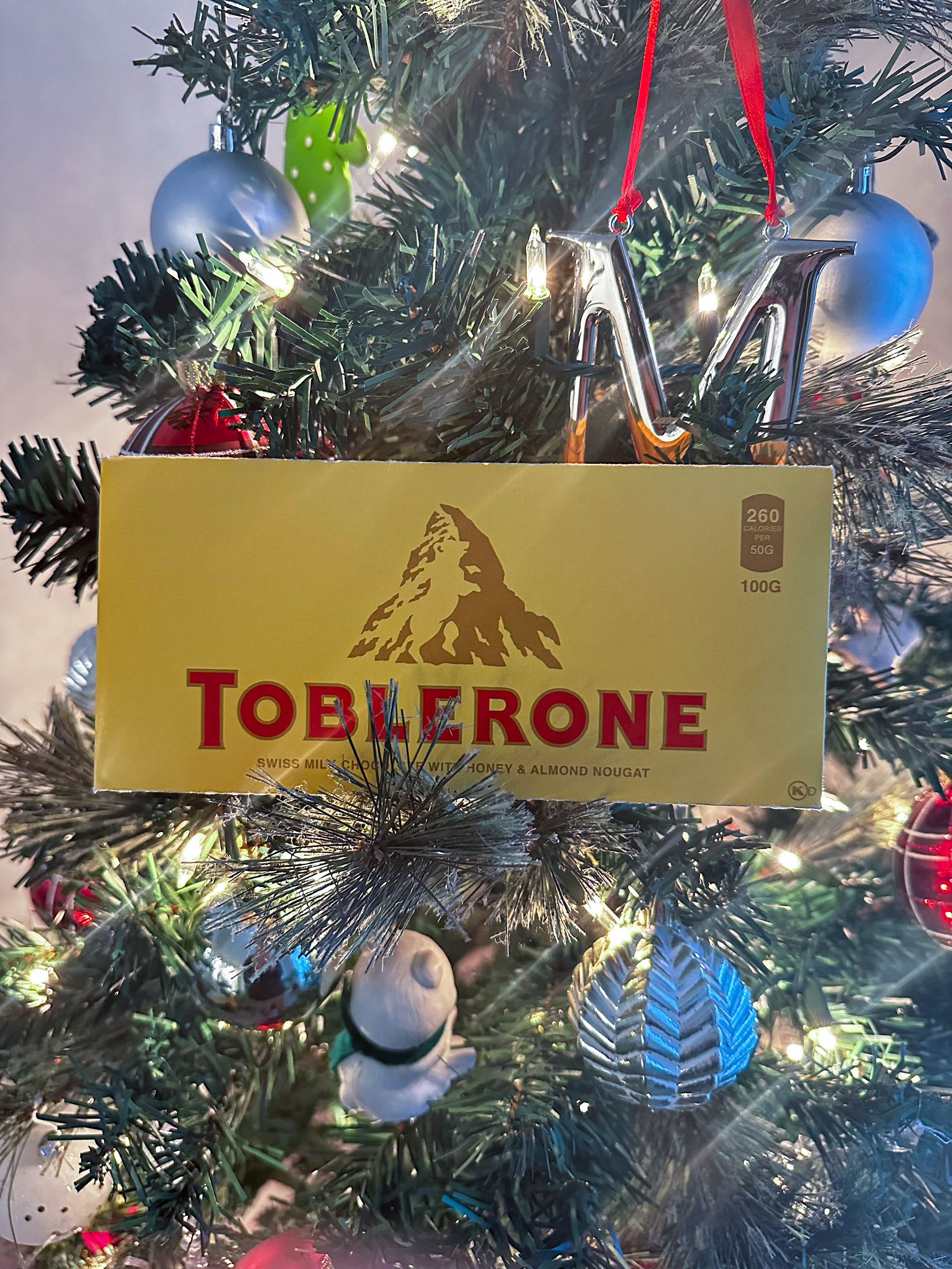
For my wildcard design, I opted for a festive approach inspired by Toblerone’s tradition of creating playful and festive editions. This Christmas-themed design aims to appeal to a broad audience by blending a playful atmosphere to engage younger consumers while maintaining the sophisticated gold and red palette to attract an older demographic. The design features a lively Christmas scene with Santa stuck in the chimney, reindeer soaring through the night sky, and the mischievous Rudolph conspicuously absent from houses shaped like Toblerone bars. To enhance legibility and cohesion, I darkened the text to match the brown color from the front of the design, ensuring a seamless integration of all elements. This whimsical and celebratory design not only adds a touch of holiday cheer to the Toblerone brand but also introduces an element of fun and surprise for consumers during the festive season.